Feedback from
our clients
The Queens Hotel — Ennis, Clare
Project Overview
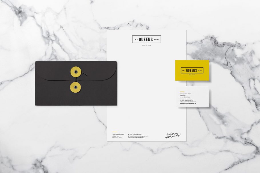
Little Blue Studio’s branding design for Queen’s Hotel in Ennis, Ireland is strong, modern and fresh.
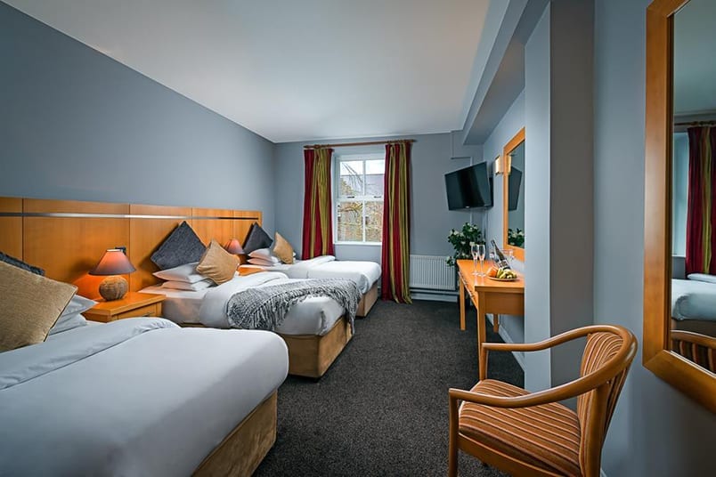
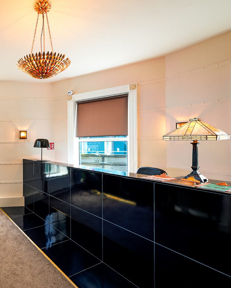
The hotel is located in the heart of the town, and a great base to explore all that is vibrant and exciting in Ennis today. The theme is friendly, informal, clean, crisp and enthusiastic, inspired by the investigation and discovery with my clients.
Services:
- BRAND STRATEGY & BRAND IDENTITY
- TONE OF VOICE
- ART DIRECTION
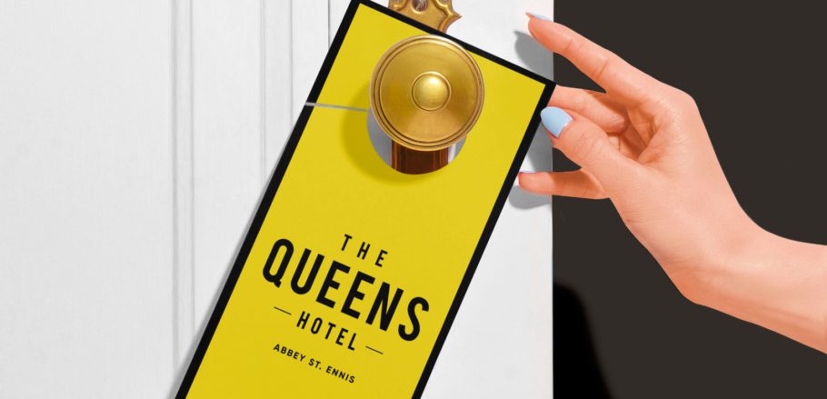
Brand Strategy Brief
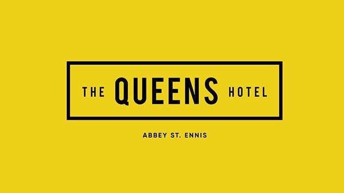
The letter Q is really modern and informal. Our brand expert carefully selected a fun range of colours to accompany the design elements for The Queens Hotel.
The use of uppercase font BEBAS holds the strength of the building but the sans serif gives it a friendly feel with it’s clean lines, elegant shapes, a blend of technical straightforwardness and simple warmth which make it uniformly great for this brand.
- Brand Development
Workshop - Brand
Strategy - Story &
Tone of Voice - Identify Development
& Systems - Brand Guidelines
& Deliverables
