Feedback from
our clients
Blissance – Where Love Grows
Project Overview
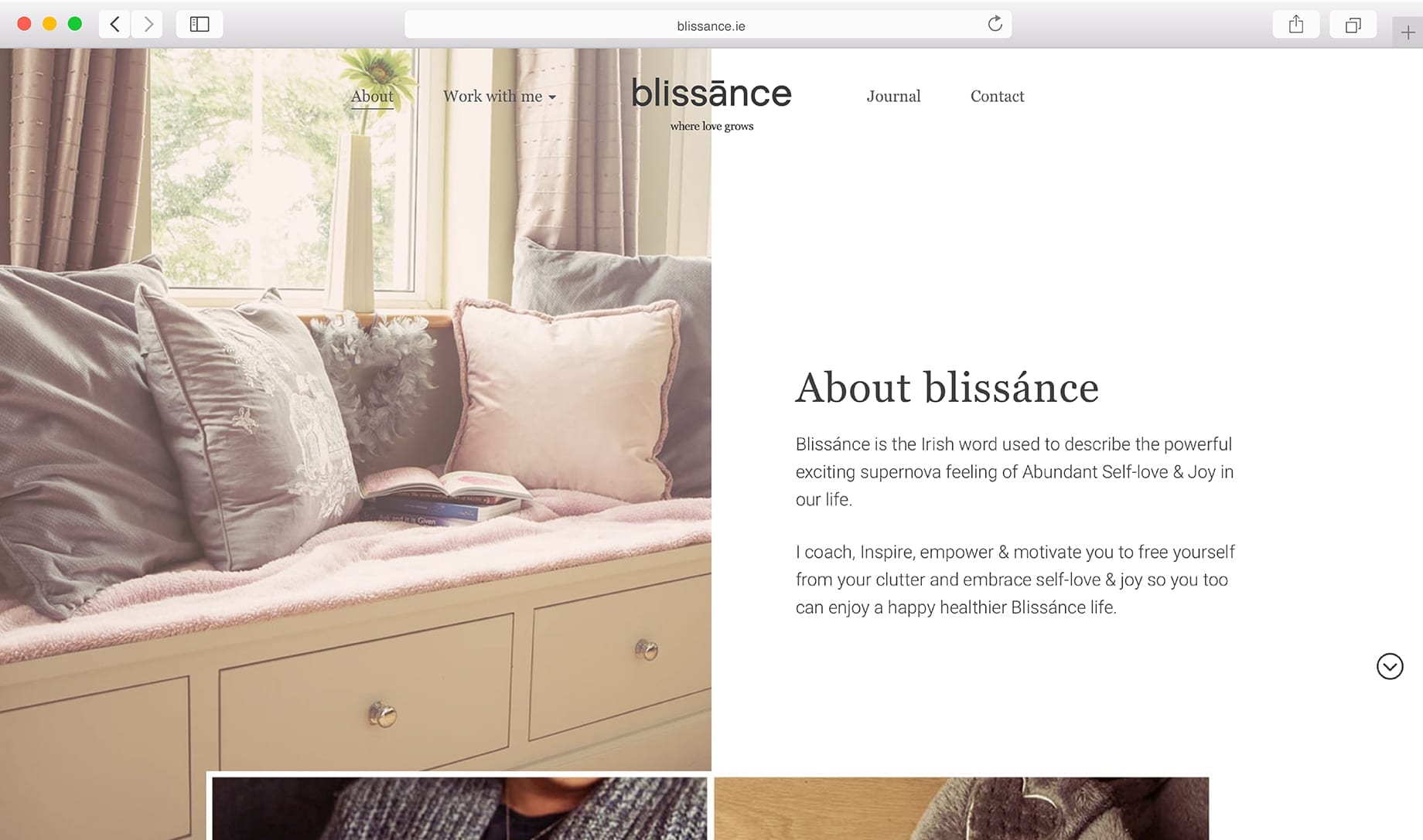
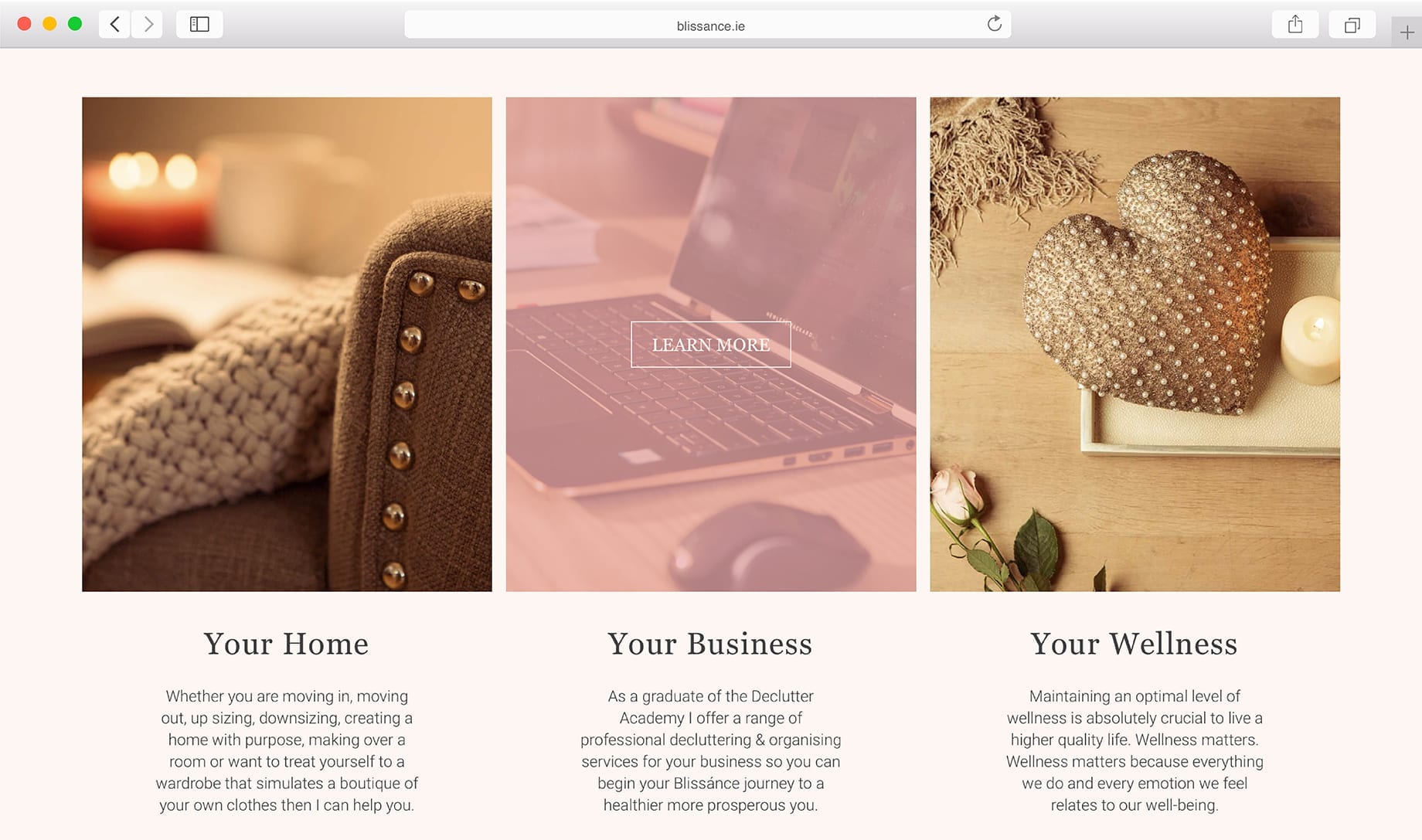
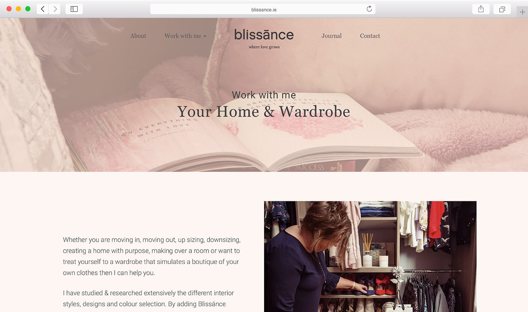
Little Blue Studio’s webdesign reflects the warm and inspiring atmosphere of the Blissance method. This is supported by a brand identity that is creative, professional and enthusiastic.
Sandra from Blissance teaches people the importance of self-love and joy in everyday life. She inspires her clients to lead a happier and healthier life. We were delighted to help communicate her empowering message.
Services:
- WEBSITE DESIGN AND DEVELOPMENT
- BRAND STRATEGY BRAND IDENTITY
- TONE OF VOICE / ART DIRECTION
- STORYTELLING

Brand Design Brief
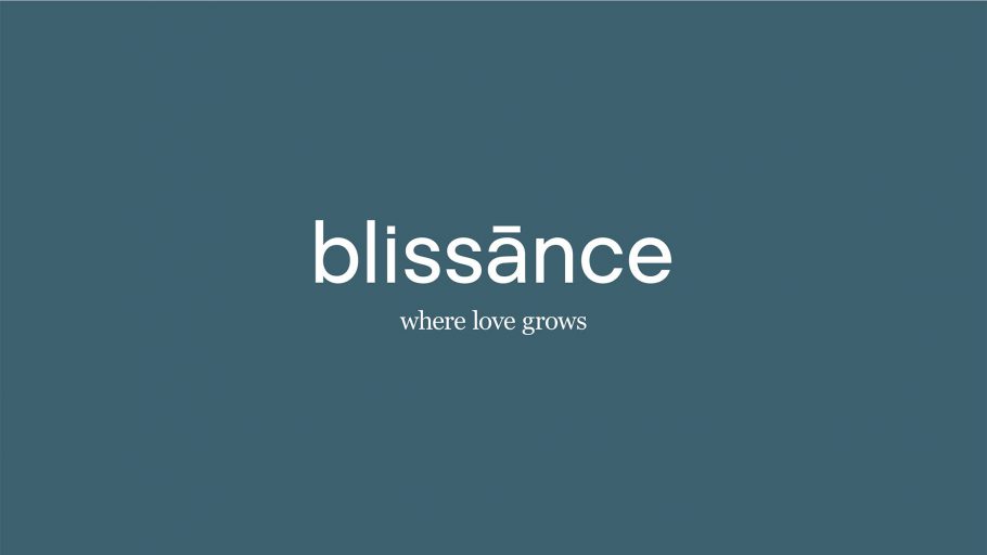
The letter “a” consists of a macron that exhibits the Blissánce brand’s supportive side to the customer. The sub brand consists of the “b” with an underscore, also known as the dot that doesn’t stop. Connecting back to the brand is the tagline of “where love grows” and never ends.
The brand pattern was created using the “b” in the typeface which was transformed into a contemporary butterfly pattern that is unique to the identity. Again bringing it back to the Blissánce method and how it is transformational and life changing!
- BRAND DEVELOPMENT
WORKSHOP
- BRAND
STRATEGY - STORY &
TONE OF VOICE - IDENTIFY DEVELOPMENT
& SYSTEMS - BRAND GUIDELINES
& DELIVERABLES

Web Design Brief
Deluttering is an important concept and consideration of the Blissance method. It was important to reflect this in the web design for Sandra. Throughout the website there is a flow and balance to the content, mirroring the harmony of the Blissance Method.
We began with a workshop where we worked on our strategy for the development process. The process then continued as outlined below.
- STRATEGY &
WORKSHOP
- ANALYSIS & CONCEPT
DEVELOPMENT
- DEVELOPMENT &
PROGRAMMING - USER
TESTING - SITE UPLOAD
& TRAINING

